CritterTown BathHouse Redesign
Overview
I often visit CritterTown BathHouse (CTBH) to give my dog baths and noticed their website needed a major update to match their excellent in-person service. I started a hypothetical website redesign.
Based on first impressions, the website seemed like a deterrent for future customers because it looked very outdated and disorganized, which may lead viewers to believe the business is not credible.
I also wanted first-hand experience in testing the hypothesis "Bad UI often means bad UX".

Role
User Experience Researcher & Designer

Responsibilities
User Research, Competitive Analysis, Interviewing, Wireframing, Prototyping, Brand Identity

Tools
Figma, Zoom, Maze
Experience Design
Understanding business goals
After a quick review of the website, I got in touch with the manager to learn more about what she wanted the website to convey. The main goals are:
-
Featuring essential information about the business (like hours, locations, and services provided).
-
Converting new and old customers to members by showcasing membership benefits.
-
Allowing people to easily sign up for a membership through an online portal.
Understanding the competition
Richmond is a city that loves dogs! It is home to several self-service pet wash businesses (direct competitors) and groomers (indirect competitors). To determine the strengths and weaknesses of the competition, I conducted a S.W.O.T. analysis for each competitor's website.

Bark & Sparkle
Direct Competitor

Diamonds & Dutch
Direct Competitor

Dogma
Indirect Competitor
The opportunities I found to improve CTBH's online experience include:
-
Using brevity in copy
-
Utilizing interaction design and animation to make the experience dynamic
-
Defining CTA buttons
-
Using iconography and imagery to guide the user's eye
Understanding current users
I began to explore user opinions by conducting a System Usability Scale (SUS) evaluation on the current website. The results showed a score of 56, indicating room for improvement. I set a goal to increase the score by 30% from here.

Then I sought to gain a deeper understanding of how users interacted with the current website, so I conducted a usability test with 3 dog owners and 1 potential dog owner via Zoom.

Eric and his girlfriend, Lindsey, share a dog. They prefer to use a self-service pet wash because their dog is very hyper and doesn't sit still for baths at home. The fact that they don't have to bring their own supplies is also a benefit!
Eric, 26
Norfolk, VA

Joanna, 29
Trenton, NJ
Joanna and her boyfriend, Jared, share a dog. They take their dog to a groomer when she needs special TLC and wash her at home for maintenance. They are considering using a self-service pet wash because the groomer tends to be expensive.

Angela has owned her dog since she was a child. She has used a self-service pet wash before, but it didn’t work out because her dog is anxious around other dogs. She may reconsider if there was a way for her to have the facility to herself.
Angela, 27
Berlin, Germany

Serena is considering getting a dog, but she has been indecisive about how she will care for it. When it comes to grooming, she does not want to pay for a groomer, but she also does not want to clean a mess in her own bathroom. She wants more info about how self-service pet washes work.
Serena, 30
Los Angeles, CA
These interviews led me to 2 main insights:
1. They wanted to know more about how non-members could patronize the business.
“If I moved to RVA and looked for somewhere to wash my dog, I wouldn’t choose here... the website is not very inviting.” -Eric
“I feel like hours, locations, and prices are well communicated for members and potential members, but it doesn't tell me what I can do to test the facility. ” -Angela
2. Users want a concise, scannable website with information that is easy to comprehend.
"Some info is difficult to read because of the text size and distracting videos." -Serena
"There is a lot going on on the membership page. I know the info is necessary, but it should be condensed." -Joanna
Organizing & rebuilding
The first step I took was organizing my thoughts on what needed to be restructured and what was working on the original website. (View screenshots of the original site below)


I considered the following constraints when planning the site:
-
The owner uses Wix.com to host the website, so I needed to make sure everything I designed could be replicated on a website builder.
-
Users were able to complete some tasks while on the website, so I needed to maintain the functional parts of the current information architecture.
The second step I took was organizing the content across the website in a sitemap to reduce repetition and provide a better structure.

The final step was researching prevalent website designs to determine the best content arrangement. Following ideation and sketching, I created low-fidelity wireframes.


Establishing brand identity
To align the in-person and online experiences, I evaluated the business's social media and brand images. The outcome was a curated mood board and a unified design system to guide the business in maintaining a consistent brand image.


Designing & testing mockups
After finalizing high-fidelity mockups, I conducted a usability test using Maze and Google Forms. Maze helped me measure quantitative data, while Google Forms helped me collect qualitative data. The results from this round of testing helped me develop insights into what could be improved on the website.

Quantitative Results

Time on Task*
2min & 48s

Task Success Rate*
100% Direct Success

System Usability Scale
89
Qualitative Results
UX Copy
“The clean-as-you-go part of the membership page was a little unclear for me. I could not tell if the customer had to clean or if it was a service being offered.”
“I thought 'Start Your Membership Today' was a button to sign up.”
Page Structure
“I did not like the membership sign-up screen because there was still a lot to scroll through.”
Supplemental Info
“I wish there were an immediate way for me to know what I can do as a non-member.”
“I think the 'Bathhouse Tab' is good at explaining what will be offered when you come in to wash your dog, but it doesn't necessarily explain how to actually use the washing or grooming areas.”
* Time on Task & Task Success Rate: I observed how users performed the main task of the site (signing up for a membership through an online portal), and the average time on task was 2 minutes and 48 secs. To me, this meant that the time on task indicated users were actually taking the time to read through the terms of service before signing up for a membership. The task success rate indicated that the flow was intuitive.
Using insights to finalize designs
Here are the changes I made to the website based on user feedback:
-
Made it easier for non-members to figure out how they can use the business by adding an element in the navigation bar.
-
Provided clarity throughout visual elements and copy by redesigning elements.
-
Restructured membership form elements for a better experience.


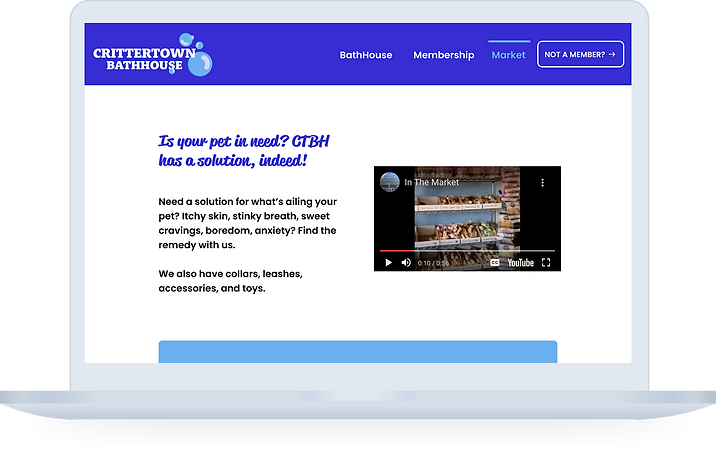
Conclusion
Based on user testing results, I concluded that I designed a website that provided plainly listed information and clear pathways for completing tasks compared to the original.
My goal to lessen repetition and provide clear branding was achieved! This was expressed through an SUS score of 56 being pushed to 89 (achieving the goal of 85 or higher).
The SUS score increase also represents that the hypothesis "Bad UI often means bad UX" was proven to be true.
An important lesson I learned throughout this website redesign is that sometimes business needs take priority over user wants or needs.
At the beginning of the project, I recognized that getting users to sign up for a membership and actually read the agreement terms was a top priority for the business. Through user testing, users found it cumbersome to scroll through the whole form. Despite the feedback, my initial plan was to keep the page the same, but through further contemplation, I realized the purpose of a UX Designer is to use creativity to find the best solution. I decided to make the page content less intimidating by implementing a PDF reader. Although business needs may take priority in some cases, I should always strive for a happy medium.
This project was executed as a hypothetical redesign, but if the client decided to move forward with this solution, I would focus on the expansion of the website next by doing the following:
-
Making sure that the website is optimized for mobile, considering that Wix reforms your web design to mobile automatically.
-
Working with the stakeholders to make sure that the Square Site for online ordering matches the main website’s experience.
-
Discussing including resources on the site that would further establish the business's position in the community (like a special event calendar).