synRG: Wellness Support for Black Women
Overview
My client Sami, a mental health nurse practitioner, hired me to create the first version (MVP) of synRG, an app that supports Black women on their mental health journeys with resources and community.

Role
Freelance Product Designer

Responsibilities
User research, Competitive analysis, Experience design, Brand identity

Tools
Figma, Notion, Adobe Illustrator, Adalo, Zoom
Experience Design: Phase 1
Establishing the goal
During the initial meeting with my client, we took the time to align goals (timeline, feasibility, and deliverables), identify the app's purpose, review previously ideated screens, and establish desired features.
The insights I gathered from the meeting were that we are focusing on:
-
Filling the gap in the holistic wellness space that does not cater to black women.
-
Obtaining user feedback from the target audience to determine their needs and preferences, which will contribute to the app's success.
-
Establishing the app's structure and identity.
Identifying target users
To begin, I surveyed a group of women to identify the specific challenges they encounter in their wellness journeys. Additionally, I sought to evaluate the perceived value of features previously proposed by the client and identify any additional features that would be of interest to the target audience.
I was able to develop a clear picture of user needs with 28 survey responses. An affinity map helped me organize feedback, identify themes among survey responses, and develop insights.

Click image to view full map.
It also helped me identify users' common personal habits so that I could develop personas.


Using all of this information, I was able to narrow down my problem statement.
Women are struggling in the inequitable and problematic holistic wellness space, turning to social media for tips, which often has similar issues. They seek an inclusive, safe space to address health and wellness challenges openly."
Identifying the competition
In order to get a better idea of where this new product would fit in the digital health and wellness space, I performed a competitive analysis on 3 direct competitors and 3 indirect competitors.

The key takeaways from the evaluation were:
-
Users connect with supplemental resources like videos, articles, podcasts, etc.
-
A strong social media presence will make it easier for users to find and learn about your services.
-
Users value spaces that feel like they are made specifically for them more than spaces that include everyone.
-
Visual Design should be unique and appealing, but not so complex that it confuses users.
-
Presenting users with clear payment models, rules, and expectations is going to promote trust between a company and its consumers.
Finding the solution
After my initial research, I took the time to ideate some features that may help solve user pain points. Here, I worked with my client to assign priority to each feature by using a feature prioritization map.

Click image to view full map.
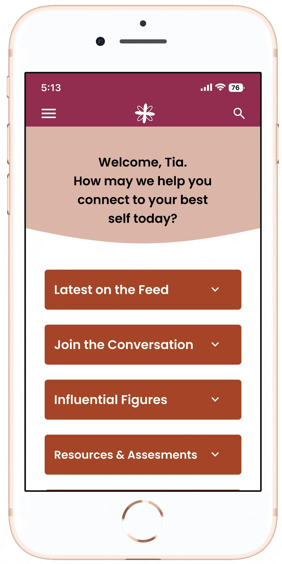
The most important things to be included in the MVP were:

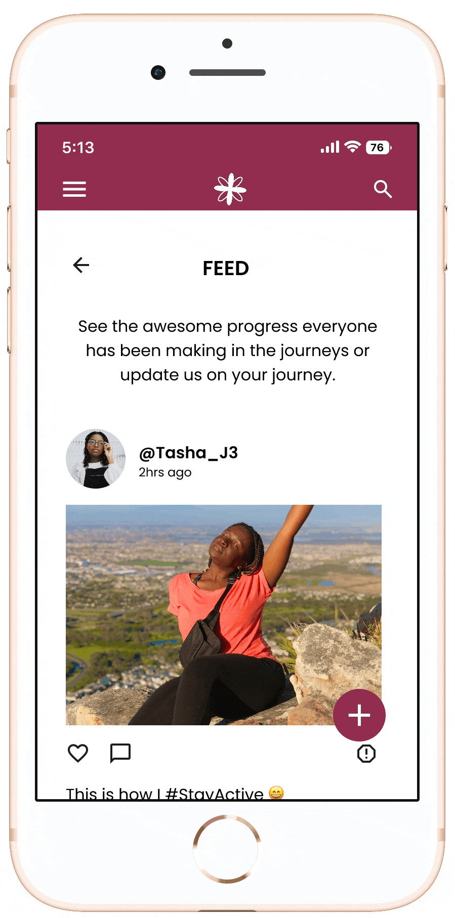
Social Feed
Serves as an update hub for users to share anything - from quick updates on progress to cool tools they found that could help someone else.

Wellness Forum
Encourages users to have healthy conversations about different wellness topics with their peers, so that they can build community.

Coaching
Connects users to healthcare practitioners serving as wellness coaches if they need guidance in their wellness journeys.

Resorces
Supplemental information is provided to users through articles, worksheets, wellness influencers, and access to a mental health assessment.
After identifying what would be included, I established the skeleton of the app with an information architecture. I began with the information architecture of the initial screens, but through user testing and client discussions, the IA expanded to fit added features (final IA pictured below).

Click image to view full map.
The client let me know that the final project would be launched on Adalo, a no-code app builder. Before I started getting my ideas out on what the product would look like, I had to acknowledge the following constraints:
-
Adalo is not fully customizable, so I had to cross-reference YouTube videos and search the web to make sure what I built was able to be replicated by the Adalo developer.
-
Adalo apps can be launched on Android and iPhone, so I was not able to follow Material Design (Android) or Human Interface guidelines (Apple), since the product would not be platform-specific.
Once I established the structure, I began to sketch and build out screens, which resulted in a mid-fidelity prototype to be tested with users.

I established the company's brand identity while awaiting user testing results. During this phase, I collaborated with the client to define the brand's mission, vision, values, and tone/voice. Then, I developed a visual identity, including a mood board, logo, color palette, and typeface with usage guidelines.

Testing the solution
I conducted a usability test on the mid-fidelity prototype to learn users' thought processes while exploring the app and get a sense of how valuable the app would be to them.
Task: Homepage A/B Test
Purpose: I worked to come up with 2 different homepage experiences and tested each to see which was more intuitive.
Findings: 50% of users preferred a condensed page, while the other 50% preferred an expanded page. This suggested a need for a new homepage that brings together the best elements of both.

Task: Posting in the App
Purpose: To determine if it is easy or difficult to know where users are posting in the app (in the forum, feed, or commenting).
Findings: Users were able to identify where they posted because of the use of screen headings and the "easy-to-use" hamburger menu. However, users noticed that they were able to comment on feed and forum posts, but there was no way to see others' comments. I added this functionality to further encourage conversation.

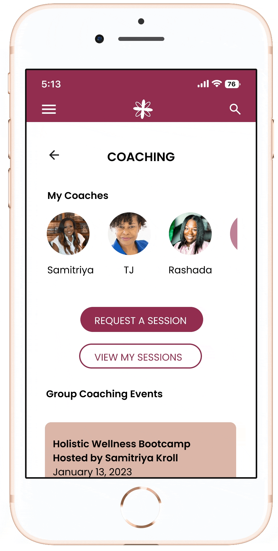
Task: Requesting Coaching
Purpose: To determine if it was easy for users to find coaches, request a coaching session, and sign up for group coaching events.
Findings: Users found it easy to identify all elements of the coaching flow. One user suggested reducing unnecessary navigation by making it possible to request coaching from the coach's bio screen.


Experience Design: Phase 2
synRg for Admin
My client needed other wellness professionals (admin) to have access to the app with functionality specifically for coaches and moderators. So I built additional screens so that they have access to the same features as users, with added editing and posting functionality.
Coaches and moderators can:


Conclusion
Overall, tested users found the app to be intuitive, easy to navigate, and a useful tool in their wellness journeys because it fills a void missing in the market for black women. Their support was shown through a net promoter score of 100.
The GIFs below are demonstrations of key features.
Onboarding flow & Demonstration of a Forum Post
Resources Flow & Article Preview
Coaching Flow & Signing up for an individual session
The biggest takeaway was learning how to effectively communicate my UX process and design decisions, including explaining technical terms to non-technical stakeholders. I also learned to ask questions and avoid assumptions. This helped me advocate for the user experience and helped my client understand the importance of practicality and seamlessness across the product.
Sami hired me to improve upon her app so that she would be able to launch a beta test with a full app in Adalo, but if I were to continue working on this project, I would:
-
Launch a usability test among the target audience to validate or expand upon findings from the first usability test
-
Launch a usability test among coaches to make sure their flow is still intuitive and easy to use
-
Start to implement the next priority-level features